
In preparation for CTN, I put together a new layout in a style that I tend to chase from year to year without ever following through. I kind of dipped into surrealism while living in the dorms at UW. A suitable application for my doodling, but never saw it as a means to get hired. Every year as I'm ramping up my reel and portfolio revisions, I'll start throwing something together that is inevitably swapped into a much simpler, straight-forward graphic design; a pragmatic, keep-it-simple approach with the notion that "there's no bullshit here, only the reel matters." A friend recently convinced me otherwise.
Gritting her teeth, to avoid saying anything too hurtful, she explained that if you're going to do the graphic approach - you need to execute better than Squarespace, Wordpress, or whoever else. I've always hated the idea of that (as I type on a Blogger site) in terms of personal responsibility - this is mine, you know. But I'm not a professional web designer, I'm an animator - I can't keep up with everything. The graphic approach says nothing about me. It's squares and shit. I wasn't thinking that broadly at the time, but don't be a square.
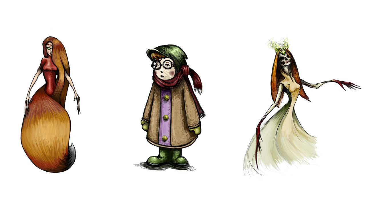
As she flipped through my sketchbook, something that stuck with me was "show me motion." Wow, duh. I showed her some of my surreal stuff, some failed designs and was met with "you've already finished all of these drawings... just find an interesting way to put them together." So I did. I had to fill in some gaps, create the idea of interconnected-ness, purposely keep some of it raw. Far from perfect, it's enough for this year. Felt good to loosen up and do some serious doodling, I'm glad someone was paying enough attention to remind me.
Time to figure out some new shots.


